The colors we surround ourselves with at home can do more than just make a room look nice—they actually shape the way we feel and function. From boosting productivity in your home office to creating a sense of calm in your bedroom, color psychology is one of the most underrated tools in home design. And for homeowners in Raleigh and Durham, choosing the right paint colors can make all the difference in how your home feels day-to-day.
At New Image Painting and Renovations, we’ve worked in hundreds of homes across neighborhoods like Hope Valley Farms, North Ridge, and Old West Durham. We’ve seen firsthand how the right color choice can transform not just the space—but the energy in it. Let’s dive into how color psychology works, and how you can use it to create a more intentional home.
Understanding Color Psychology
Color psychology is the study of how different colors affect our mood, behavior, and even physiological responses. It’s why hospitals often use calming blues and greens, or why fast-food chains use red and yellow to stimulate appetite. When applied in your home, these concepts can help create the kind of atmosphere you want—whether it’s relaxation, focus, energy, or warmth.
Calming Neutrals: Great for Bedrooms and Living Areas
Colors like soft greys, warm beiges, and creamy whites are timeless choices for a reason. They’re calm, clean, and promote relaxation—making them perfect for bedrooms and main living areas. In homes across North Raleigh and Cary, we’ve used neutral palettes to create a grounded and sophisticated feel that still allows room for personal décor and pops of color.
Neutral doesn’t mean boring. Choosing the right undertone—cool or warm—can help you balance natural light, match your furniture, and even make rooms feel more open or cozy.
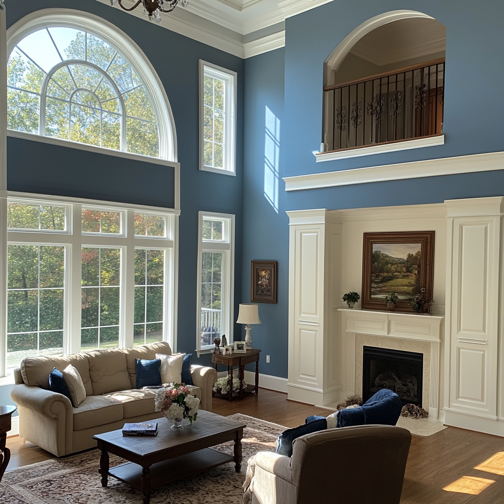
Blue Tones: Focused, Relaxing, and Productive
Blues are the go-to color for creating a sense of calm and clarity. Lighter shades work beautifully in bedrooms or bathrooms, promoting rest and serenity. In contrast, richer navy blues or denim tones are excellent in home offices or libraries, where you want to stay grounded and focused.
We recently completed a home office refresh in South Durham using a deep slate blue—and the client said it made their work-from-home setup feel instantly more put-together and peaceful.
Greens: Balance, Freshness, and Renewal
Green is associated with growth, balance, and nature. It’s one of the most versatile colors because it brings a sense of freshness without being too cold or too warm. Sage green and olive tones are increasingly popular in kitchens and living rooms, while mint or pistachio greens work wonders in bathrooms and kids’ rooms.
Homes in areas like Trinity Park and Wakefield Plantation have been leaning into earthy green palettes to bring in more of that indoor-outdoor feel.
Yellows and Oranges: Energy and Creativity (In the Right Dose)
Warm colors like yellow, coral, and soft terracotta can bring energy and optimism into your home—but they’re best used carefully. A bright yellow kitchen may feel invigorating for some and overwhelming for others. We often recommend using these tones as accent walls or in rooms where energy is welcome, like kitchens, craft rooms, or breakfast nooks.
A homeowner in Brier Creek used a muted sunflower yellow for a reading corner in their sunroom—and it turned the space into the most cheerful part of the house.
Reds: Warmth and Passion
Red is one of the most stimulating colors, often associated with passion, strength, and excitement. Because of its intensity, it works best in smaller doses—think dining room accent walls, bold powder rooms, or even front doors. We’ve found that deeper reds like oxblood, rust, or brick tones create more elegance and less intensity than fire-engine reds.
In MacGregor Downs, we helped a client pair a deep wine-colored dining room wall with crisp white trim and gold accents—it instantly elevated the whole feel of the home.
The New Power Neutrals: Greige, Taupe, and Soft Black
More homeowners in Raleigh and Durham are embracing modern “power neutrals.” These are colors like greige (a mix of grey and beige), soft black, or charcoal that offer depth without overwhelming a room. These tones are especially popular in open-concept homes and are great for adding contrast while staying neutral.
We’ve painted several kitchens in North Hills with soft black islands or greige lower cabinets—and the look is both timeless and on-trend.
Choosing Colors for Productivity
If you work from home or have kids doing homework or remote learning, color matters. As a rule of thumb:
- Blue tones help with focus and concentration.
- Green tones reduce eye strain and improve efficiency.
- Warm neutrals promote comfort and reduce anxiety.
For multi-use spaces, we often recommend using paint to visually define zones. A kitchen can feel more energizing with a warm hue, while an adjacent work nook painted in a deep blue creates a mental shift into productivity mode.
The Importance of Natural Light
Keep in mind: the way a color looks on the swatch is rarely how it looks on your wall. Lighting changes everything. North-facing rooms may make colors appear cooler, while south-facing rooms bring out warmth. At New Image Painting, we always factor in your home’s natural light before recommending a final palette.
What About the Finish?
Don’t forget that the paint finish also impacts how a room feels. Matte and eggshell finishes give a softer, more relaxed look, while satin and semi-gloss finishes feel more polished and reflect more light—perfect for trim, doors, and high-traffic areas.
Make It Personal
At the end of the day, your home should reflect you. Color psychology gives you the tools, but your preferences and lifestyle matter most. Love bold jewel tones? Prefer a clean, white-on-white look? We’ll help you strike the right balance between aesthetics and emotion.
Ready to Refresh Your Home’s Energy?
Whether you’re looking to recharge your bedroom, create a calm office space, or brighten up your kitchen, color plays a bigger role than most people realize. At New Image Painting and Renovations, we don’t just paint walls—we help create spaces that feel right for how you live.
Let’s find the colors that reflect your mood, support your goals, and make your home feel like the sanctuary it should be. Reach out today for a free color consultation and estimate. We proudly serve Raleigh, Durham, and surrounding communities like Hope Valley, North Hills, and Old West Durham. Your perfect palette is just a call away.